
February 24, 2023, by Helen Whitehead
Take a NAP 3: Images
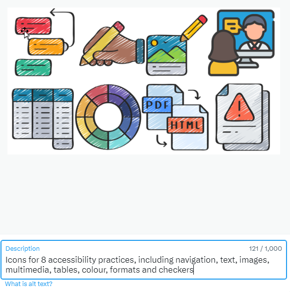
This is the third in a series of blog posts in which we’re looking at the NAPs, Nottingham Accessibility Practices. These are eight core habits that will help make your teaching materials and publications more accessible, but also more available to all.
Images are regularly used elements within teaching materials and assignment submissions, but their visual format can limit their reach. Visual aids can be great tools to deepen lessons and aid comprehension, but they will only be valuable if they can be accessed and understood by all users. Images can be made accessible by writing a good description in the alternative text (ALT-text) but also through ensuring the image is of good quality and relevance.
Quality of images
First ensure that you have a good quality image and that it’s needed in the context – is it worthwhile to illustrate your content? If the image is really amazing, but actually nothing to do with your content, just there to attract attention or make the text look attractive, do you really need it? Avoid using images of text that is meant to be read, such as a heading. Although students can use assistive technology to recognise text in the image, it might not be apparent that it is there.
 ALT-text
Providing alternative text or ALT-text is one of the most important things you can do to make your images accessible. An ALT-text tool is often provided in word processors and other content creation software. It allows you to write a short description of the image that is embedded alongside it. Some have computer-generated ALT-text although like most automated services, it isn’t perfect, so check accuracy.
ALT-text should be less than 125 characters to be properly embedded, but it’s important to use punctuation and normal sentences. Make sure that you put the most relevant information first to ensure that the ALT-text makes sense. If a longer description of the image is required, write about the image in the main text.
Decorative images
If the image is merely decorative, it can be labelled as such in the ALT-text tool. This can be done in most ALT-text editors: there’s often a tick box, or you can use “ ” or write: “Decorative”. Labelling these images as decorative will allow screen-readers to bypass them, and reduces the cognitive load needed when readers navigate content read to them by a screen reader.
We’ll have more information about writing ALT-text in a later post, as it’s such an important skill in making items accessible. Meanwhile, the next post in this series will be on Multimedia.
Follow our “Take a NAP” series to find out more or checkout our Nottingham Accessibility Practices SharePoint site.
More in this series:
The Nottingham Accessibility Practices (NAPs): Overview
“Take a NAP” series on Accessible Practices
With thanks to Chris Ward, Digital Accessibility Consultant
Icons from juicy_fish
No comments yet, fill out a comment to be the first

Leave a Reply