February 22, 2023, by Helen Whitehead
Take a NAP 2: Text
In this series of blog posts we’re looking at the Nottingham Accessibility Practices — the NAPs. These are eight core habits that will help make your teaching materials and publications more accessible, but also more available to all. Follow our “Take a NAP” series.
Text will be the main way that a lot of your content will be accessed. Complex language can be a barrier for the reader, particularly where English is not their first language or for those with a specific learning difficulty or disorder (SpLD) such as dyslexia. A reader faced with unexpected, irregular or badly formatted text needs to work much harder to read it and might be discouraged or confused. When it’s accessible, text will be easier to understand for all users, but especially so for anyone who is using assistive technology.
 Alignment
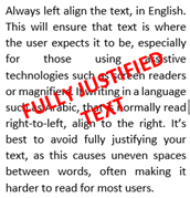
Always left align the text, in English. This will ensure that text is where the user expects it to be, especially for those using assistive technologies such as screen readers or magnifiers. If writing in a language such as Arabic, that is normally read right-to-left, align to the right. It’s best to avoid fully justifying your text, as this causes uneven spaces between words, making it harder to read for most users.
Emphasis
For similar reasons it’s recommended that you avoid using italics, underlining and capitalisation for emphasis and use bold sparingly. These differences might be lost to many users with a specific learning difficulty or using assistive technologies. Instead try to describe the importance of the point in the text, or signpost with simple textual labels.
Writing
Always try to write clearly, keeping language as simple as is appropriate. This means keeping the reader in mind when writing and using a clear and concise tone. Use straightforward language, avoiding using complicated language, and explaining long words, jargon and acronyms. Do not make assumptions on behalf of the reader and provide clear instructions for any tasks that are expected to be performed.
Layout
Paragraphs, bullet points and lists can help present any key points and data in a consistent and clear manner. Don’t use images or symbols to create list elements.
Ensure that your text has a good contrast with the background. An accessibility checker in Microsoft Office or Moodle will tell you if there’s not a big enough contrast. Rather than white, a very pale background colour will increase readability and reduces eyestrain – something like a very pale yellow (around r255, g255, b237 in the colour scale).
Now that you’ve got your layout and text right, we’ll look at images in our next blog post.
Follow our “Take a NAP” series to find out more or checkout our Nottingham Accessibility Practices SharePoint site.
More in this series:
The Nottingham Accessibility Practices (NAPs): Overview
“Take a NAP” series on Accessible Practices
With thanks to Chris Ward, Digital Accessibility Consultant
Icons from juicy_fish
No comments yet, fill out a comment to be the first

Leave a Reply