October 18, 2021, by Helen Whitehead
Moodle quick wins #1: Collapsed topics
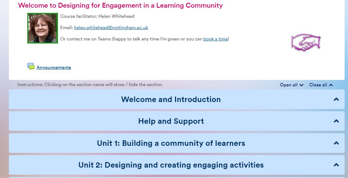
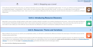
The Collapsed Topics format is an easy way to avoid the “Scroll of Death” on your Moodle page. The topics look tidy, clear, and easy to navigate. Accessibility is much improved because it’s easier for screen readers to find a section without having to read out all section contents. As a format for a Moodle module it’s had such good feedback from students that we are recommending it as the default option.
With Collapsed Topics all sections (topics) – except the top General one – have a toggle that displays that section. Normally students just have to click on the title or the blue background of the title of the section to open it up. It’s easy and intuitive for students to open the sections, although you may notice it’s a little more tricky for staff in editing mode. As a default we recommend the setting which adds instructions at the top of the collapsed section, as shown in the screenshot above.
As the editing teacher you can set it so that:
- All sections can be displayed at any given time, or only one at a time, closing the others.
- Users can expand each section individually, by clicking on the title bar (though not on the title itself), or, using Open All, show all the content in all the sections.
- Titles can be centred or left-aligned.
- Brief section summaries can be shown when the sections are collapsed, or just the title shown.
As a lecturer it can be easier to move resources and activities around in a module with Collapsed Topics because you can open just the two you need and it’s quicker to drag and drop. Also, you can duplicate a whole section if using collapsed topics.
For more information on how to implement collapsed topics, see our Help page on How to change the format of your course.
No comments yet, fill out a comment to be the first

Leave a Reply