
September 15, 2023, by Laura Nicholson
Accessible Word Documents
Many thanks and credit to Dr. Chris Ward (Digital Accessibility Consultant) and the Learning Technology Team for the blog guidance
Accessible documents ensure everyone, including people with disabilities, can access and understand the content. This promotes inclusivity and equal access to information for all.
Some helpful tips to create accessible Word documents are included below but you can find lots more detail on the Nottingham Accessibility Practices page (NAPS).
Headings and structure
Well-structured headings are crucial for accessibility because they allow all users to quickly navigate documents. Headings are also helpful for screen readers and assistive technology users and without them documents can be much harder to navigate.
Styles in Word contains preconfigured headings understood by assistive technology (e.g., Heading 1- Heading 6). This can be found under the Styles section in the Home tab, or through right-clicking on selected text.
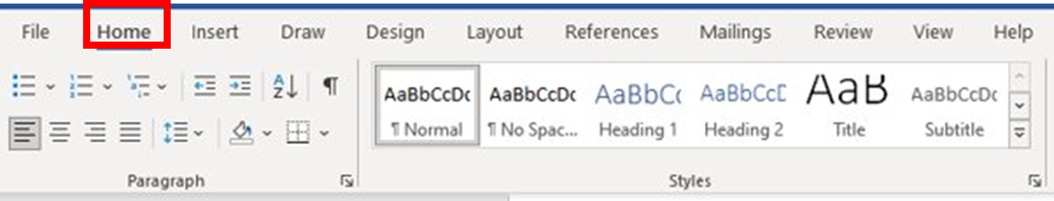
For the main heading use “Heading 1” style and then “Heading 2” for sub-headings; and further as required. This structure makes it easier for the reader to understand the hierarchy of information and navigate through the content.
Font and size
Being a digital document, people do have the option to change the font/layout for themselves if they wish. However, it is always good to:
- Use size 12 point or larger
- Especially for printing + PowerPoints: Try to use a sans serif font – such as Arial, Calibri Helvetica or Verdana
- Have a consistent font within a document – use one.
- Avoid italics or upper-case letters for emphasis as these are harder to read
- Only use bold to add emphasis – but only where emphasis is actually needed.
Colour contrast
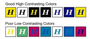
Try to ensure any colour used in documents can be easily perceived and understood by a broad audience, including individuals with visual impairments, colour blindness of low vision.
High contrast between text and its background enhances the readability of content for everyone. A good resource for comparing colour contrast is available from Web accessibility in Mind.
Examples of colour contrast
Alt Text/Alternative text
Alt text is when text is used to describe an image and can be a useful addition for a number of scenarios. For example, If internet connection is poor this can result in images not loading or taking a long time to load. In this instance, the user could be left wondering what the image was about and how it was relevant to the text. However, if Alt text is added it brings life and meaning to the image to highlight the purpose for its inclusion.
Alt text is straightforward to add, just follow the steps below,
- Right-click the picture or select from the tab.
- Click “Edit Alt Text…”
- In the Alt text pane that will open, enter a description of the image.
How to write effective Alt Text
When writing Alt text, it is best to focus on conveying the context rather than the format. So, it isn’t necessary to say “A screenshot of… ” or “Image/Picture of…” to describe the image (unless relevant). Ultimately, whether it is a screenshot or not doesn’t really matter to whoever is reading it, so this is why capturing the context should be the key focus.
So, when writing Alt text, bear these points in mind
- Summarise the image and think of its context.
- Use keywords and avoid embellishment.
- Do not use alt text for ‘decorative’ images – mark these as decorative instead.
Hyperlinks
Accessible hyperlinks are descriptive, natural and meaningful. The hyperlink text should stand out from the main body and describe the content it links to. If the content is meant to be downloaded then it is good practice to warn the user of this and include details, such as file type and size.
Tables
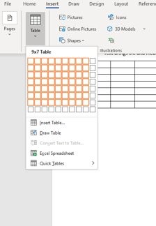
Tables are great for data but not for formatting. So, the general advice when using tables is to keep it simple and always have clear header rows. Avoid screenshots of tables as this will result in screen readers identifying the table as an image. Instead click Insert > Table.
The final point to make would be to avoid using blank cells as this could mislead someone into thinking there is no more data in the table. Instead indicate there has been deliberately omission of data by writing 0 or N/A.
To find out more about the Digital Accessibility workshops running ahead of the start of term, please contact your Faculty Learning Technology Consultant or email the team on learning-technologies@nottingham.ac.uk. Further information about the Brickfield Accessibility+ Toolkit can be found in this introductory post, written by our Digital Accessibility Consultant Dr. Chris Ward.
No comments yet, fill out a comment to be the first

Leave a Reply