March 9, 2023, by Helen Whitehead
Take a NAP 6: Colour
Colour is one of the most important features to be aware of when creating accessible content. In this post, part of our series on the eight Nottingham Accessibility Practices – the NAPs – we’ll look at why colour can be an issue and how to design to overcome that.
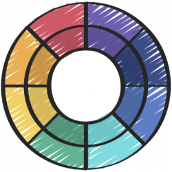
To make your content easy for everyone to read and understand, colour and shapes should never be used alone to convey meaning. No unnecessary colour or shapes should be used without a good reason to do so.
Around 4.5% of the British population now show some form of colour blindness. Increasing numbers of visual impairments are also reported, so visual elements can become a barrier to learning. Consider an important match playing at Wembley football stadium. Out of the 90,000 spectators, 5500 are likely to be colour-blind and might not be able to differentiate the team colours.
Clearly and fully describe your lesson content and any associated information. Make sure there are no hidden meanings or unnecessary colour or shape use. This can be as simple as providing labels to indicate what the colour or shape mean.
Likewise, there should be adequate contrast between text and background for information to be easily distinguishable. It’s a good idea to use a non-white but very pale colour like pale yellow (around r255, g255, b237 in the colour scale).
Follow our “Take a NAP” series to find out more or checkout our Nottingham Accessibility Practices Sharepoint site.
More in this series:
The Nottingham Accessibility Practices (NAPs): Overview
“Take a NAP” series on Accessible Practices
With thanks to Chris Ward, Digital Accessibility Consultant
Icons from juicy_fish
No comments yet, fill out a comment to be the first

Leave a Reply