March 25, 2024, by Ben Atkinson
Moodle Content and Layout Ideas – Part 2
In recent weeks the Faculty of Science have been undertaking work to review the layout and design of Moodle module sites in the faculty. This work has developed out of the move to Moodle 4.1 in December 2023 and feedback received from student reps in each school around the usability of Moodle sites.
In part two of our series on Moodle content and layout ideas, we showcase further ideas for disseminating teaching and learning content in your Moodle site. All the approaches outlines in this series make use of the layout and activity types built in as standard to Moodle 4.1

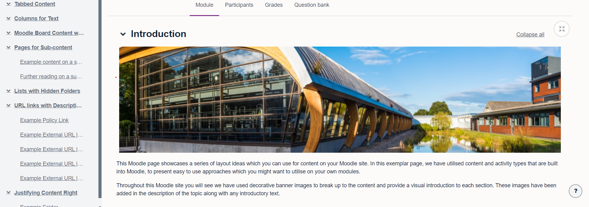
Lists with Hidden Folders
In this section we have combined two types of content to reduce the amount of space taken up my multiple folders of content on your Moodle site. Using a combination of hidden folders and links in a list, we can display content in a clear and concise manner.
First, add some folders to your Moodle site and in Common Module Settings > Availability > choose option ‘Make available but don’t display on course page’. This will show the folder for staff, but hide it from students. You can then take the URL for each folder by opening it and copying the URL from the address bar. Back in the main topic, add a bulleted list of items and create a link for each to the relevant sub folder.
URLS with Descriptions
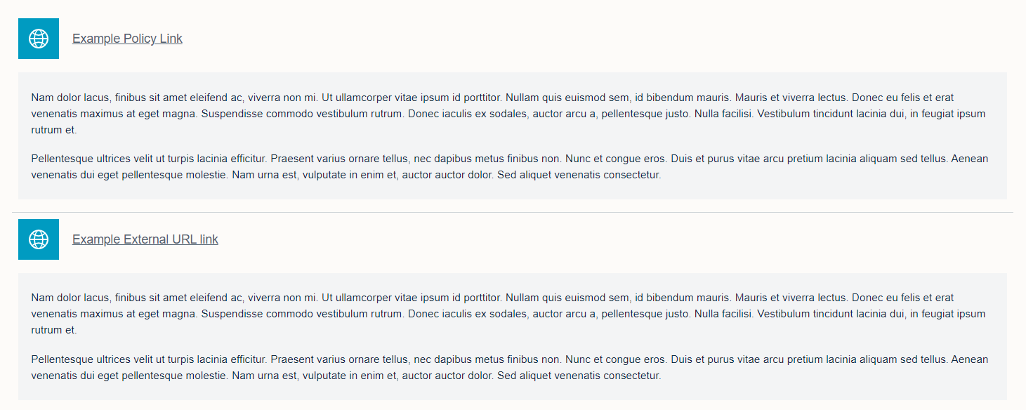
In this example, we have used the URL activity to display links to external content in a neat list. In Moodle 4.1 the URL activity is now presented with a icon to the left of the content. In order to best utilise the URL activity, we would encourage you to add a short description along with the link. This will improve the layout of multiple URL links and offer signposting to students before they click each link. Remember to ensure that links open in the same window in order to meet accessibility guidelines.

 Justifying Content Right
In Moodle 4.1 a new layout feature has been added, which allows you justify your content to the right. This can really help with the visual layout of content items, particularly where you want to clearly differentiate items as being in sub category below a title or label in your module site.
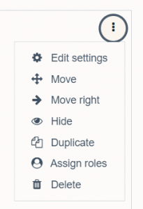
To justify content to the right in your module, first create a content item or activity. Then click the ellipses menu and ‘Move Right’ on the sub-menu. This will justify your content slightly to the right, reduce the amount of padding and highlight this as a sub-item.
For further content and layout ideas, read the first post in this series. You can also find previous posts on the use of Moodle Board, and other hints and tips to improve your use of Moodle 4.1 for teaching and learning.
No comments yet, fill out a comment to be the first

Leave a Reply