April 24, 2023, by Helen Whitehead
Moodle is Upgrading in the Summer of 2023: Moodle 4.1 is coming!
This summer Moodle will upgrade to version 4.1. This new version of Moodle brings with it lots of changes to the layout of Dashboard and My modules pages when you first login, and to your module site pages. The biggest changes in this upgrade relate to the look and feel of Moodle, such as the colours and position of the menus and buttons you will use. There are also changes to make Moodle more accessible.
Below we have outlined some of the key changes introduced in version 4.1 of Moodle. Note that any screenshots may be subject to change before the final version of Moodle 4.1 is released in the University of Nottingham.
 The Edit Mode
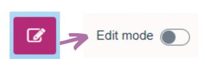
The ‘Edit Mode’ has changed from a button to a toggle switch. It is now located on the top right of every module site.
 The Participants’ Menu
The Participants’ Menu has moved, from the former magenta menu that popped out from the “hamburger” menu, to a more visible menu below the module name.
Blocks
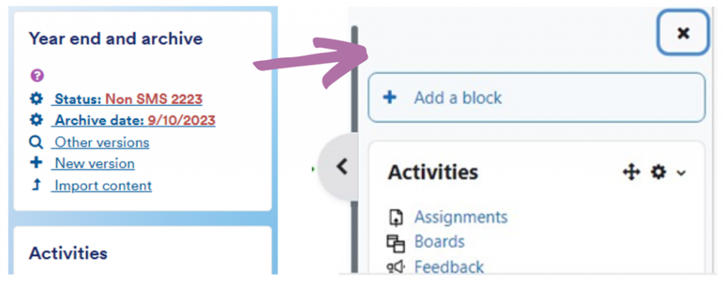
Blocks which used to be featured on the right hand column, are now more hidden in a ‘pop out’ menu. If you have a lot of content in blocks, you might want to reconsider how to show key featured content.

 The Module Index
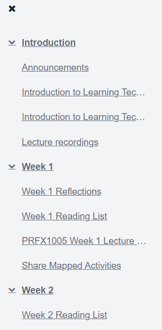
On Moodle 4.1, the Module Index is available on the left-hand side within the Topics format. This is a ‘pop out’ menu on the left hand of each module site.
Activity and Resources Menu
The activities and resources icons have changed in Moodle 4.1. They are still accessed by turning editing on and selecting ‘Add an activity or resource’. Some examples:

Moodle Board
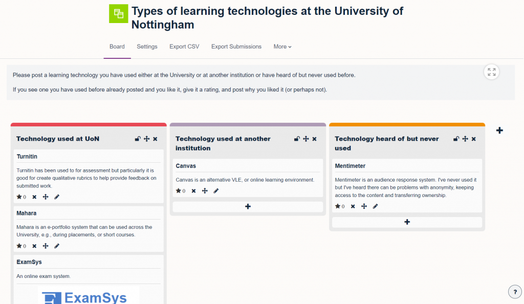
There’s a new post-it note like activity where you can get students to feed ideas onto a “Board” in categories. There’ll be more on this new feature in due course.

Changes to Navigation in Moodle
Throughout Moodle 4.1 there are new menus which aid your navigation through the main pages and within your module sites. While the main menu used to pop out from the right hand side by pressing the Hamburger icon, there is now a horizontal navigation bar at the top of each page on Moodle. You will find a similar navigation bar on the top of your module sites, allowing you to navigate between key areas of your module such as ‘Participants’, ‘Settings’ and ‘Grades’. Completion tracking is now visible to students in the left-hand Module Index. So if completion tracking is enabled, this is where they will see their progress.

There will be more information shared on Moodle 4.1 in a number of ways, including on our Sharepoint. Contact Learning Technology if you’d like to among the first to try out Moodle 4.1.
No comments yet, fill out a comment to be the first

Leave a Reply