June 30, 2020, by Joe Best
Making data meaningful for those with colour blindness
We look at some of the open source software helping researchers to make their research findings accessible to those with colour blindness, driving equality and inclusiveness.
Eight percent of men are affected by colour vision impairment, having difficulties distinguishing between colours and thereby confusing certain colours that the majority of people see readily. As researchers strive to make the results of their data available to an ever-broader range of consumers this presents a real challenge.
I looked at Color Oracle, a free (in both senses) colour blindness simulator which takes the guesswork out of designing for colour blindness by showing you in real time what people with common colour vision impairments will see – thus allowing you to see the impact of choosing particular colour palettes. It works by filtering what appears on the monitor so the user can toggle between normal colour vision and three varieties of simulated impaired vision to identify problematic colour combinations.
In the example below you can see how the software allows us to see how the choice of green, red and purple colours in the original map (on the left in both cases) would appear to those with deuteranopia, the most common form of colour blindness where people have difficulty distinguishing between red and green:
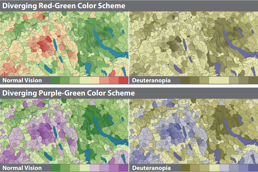
In both cases you can see that the person with deuteranopia would have real challenges interpreting the data in a meaningful way and without reference to the underlying research data. Since the brain devotes more than 50% of the cortex to the processing of visual information this presents a significant impairment to those with colour blindness.
I decided to use this software to review some of the data visualisation maps in this recent Horizon article on the reduction of NO2 pollutants over time. The article includes various images taken from the work done by Dr Folkert Boersma from the Royal Netherlands Meteorological Institute (KNMI) in conjunction with the European Space Agency that uses remote sensing equipment to monitor levels of various pollutants.
In the maps from 2017 you can see that the author has chosen a dark blue colour palette:
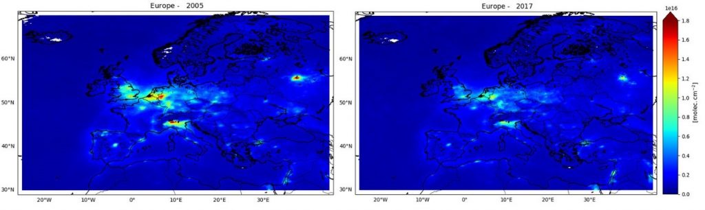
Image credit – Marina Zara (KNMI)
Not only is this particularly unsuitable for greyscale and therefore print media but the darkness of the substrate also creates a confusing depiction of the data and scale for those with deuteranopia as we can see when we use the filter in the Color Oracle software:
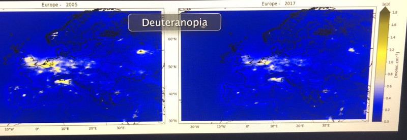
It is difficult for the viewer to see the scale and therefore interpret the findings in a meaningful way.
Compare this with the maps used by the same research institute in 2020 in which they have chosen a more muted colour palette. Using the software we can see that the view for those with normal colour vision (top) is not significantly different than for those with deuteranopia (bottom):
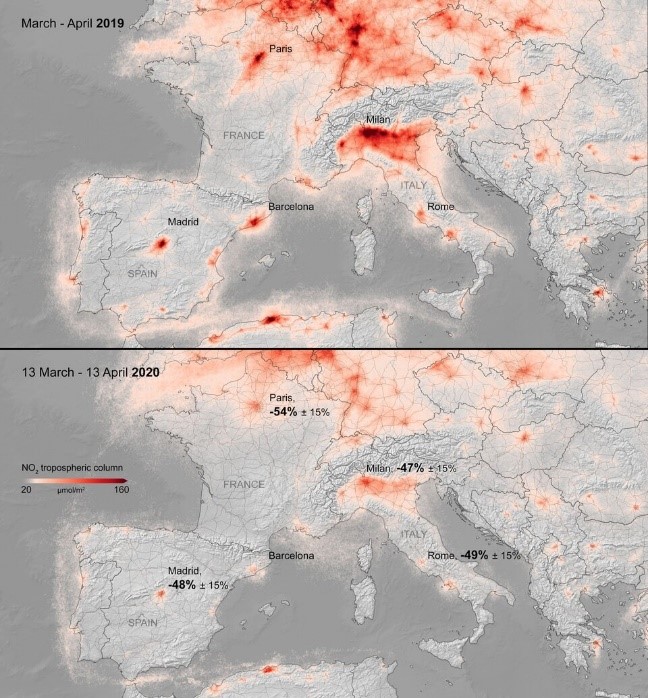
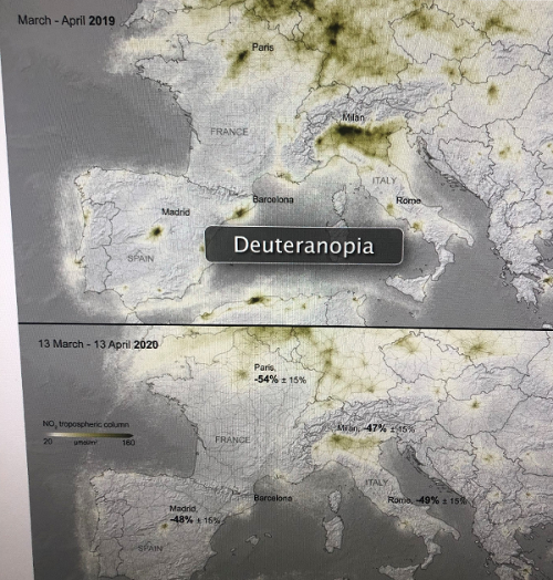
In this later map and in both cases our eyes are immediately drawn to the area around Milan where we can immediately see drastic changes between the 2019 and 2020 data. The scale and other graphical elements still tell the intended story and the impact for the reader is immediate.
An additional benefit of using a more muted colour palette is that it avoids unintentional cultural messaging. For example, in Western cultures red is widely seen as a danger sign whereas in Chinese culture red is a lucky colour.
I have included links to some resources below for the selection of colour palettes. They cater to the issues raised above and have accessibility options. All are free to use and I encourage you to do so when considering the colours you employ in your visualisations.
I’d love to hear your data visualisation stories, good and bad experiences, problems & successes. Please contact me if you have any comments or suggestions would like to learn more about data visualisation.
Useful resources:
Color Oracle – colour blindness simulator
I want hue – web based visualisation palette tool produced by MIT media lab
https://medialab.github.io/iwanthue/
Adobe color wheel – create palettes from an image
https://color.adobe.com/create/color-wheel
Sorry, comments are closed!