May 7, 2015, by Brigitte Nerlich
Images of the cell in art and science: An update
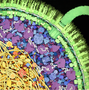
Interior of E. coli, watercolor © David Goodsell, used with permission.
This is a Guest POST by Maura C. Flannery, Professor of Biology, St. John’s University, NY, reflecting on, what one may call ‘making cells public’ and the interactions between art and science in this process. The blog is related to an images and visualisation project funded by the European Science Foundation, rather than to the Making Science Public Programme. However, there are some overlaps between the projects and I have written quite a few posts on issues around visualising science. Maura has previously written a Making Science Public post on the role of herbaria and images in botany.
•••
Brigitte has asked me to write an update of an article I published nearly 20 years ago in Leonardo on cell images in 20th-century art and science. I have to admit that at the moment I am obsessed with plants, not cells, but I have a lingering affection for the latter, so much so that I’ve decided to take a stab at fulfilling Brigitte’s request. One of my major points in that earlier piece was that there is a cell iconography pervading both artistic and scientific representations. As the iconography of the rhinoceros was strongly influenced by a single image, that of Albrecht Durer’s 1515 woodcut (Clarke, 1986), Bunji Tagawa’s 1961 pen-and-ink drawing that appeared in a special issue of Scientific American became an iconic cell image. Versions of it are still prevalent today, though many of them are now in color. Essentially it showed the major cell organelles that became visible with the electron microscope and opened up a subcellular world that before had been represented by what could be called the fried egg model: a blob of cytoplasm with a nucleus toward its center.
As far as I’m concerned, the next big advance in cellular representation occurred in the early 1990s and again involved pen and ink. David Goodsell’s images of the interior of bacteria are totally different from any previous rendition. He clearly conveys the idea that the cell is packed with structures and molecules, and his images became iconic. He later did a similar image in color (see figure above), as well as interior views of eukaryotic cells; adding color makes the different elements more intelligible. His palette runs to the pastels and is much less jarring than the sometimes lurid cell images in textbooks. Since very few cell structures have much color, the choice in each case is arbitrary and Goodsell has a particularly good color sense. The color issue continues to be a problem in cell visualizations: there is no standardization. While in chemistry, an oxygen atom is always red, sulfur is yellow, etc., color use in biology is chaotic, making it sometimes difficult to figure out just what structure is being depicted.
What’s new now
While the color problem hasn’t gone away, there are a great many new techniques now used in imaging cells both for research and for teaching. For the latter, still images have given way to videos which simulate cellular processes; those of Drew Berry and David Bolinsky are particularly noteworthy. It’s interesting to look at the work of each and compare their respective strengths. There are subtle differences in use of color and how molecular motion is suggested. While images like Goodsell’s require some orientation to decipher them, this becomes a bigger issue with videos, though voice overs and labeling do help. Balancing this is the time factor: the image often changes before its meaning has been grasped. The colors also tend to the pastel, but there seems to be a tendency to use a lot of gray, which makes the environments appear dull and perhaps a little menacing.
An important trend in imaging cells in research is fluorescence microscopy, a technique that earned its developers the 2014 Nobel Prize in Chemistry. It is a complex process that involves labeling cell elements with chemical tags that fluoresce. The background, which isn’t tagged, remains black, making the labeled structures boldly stand out. A number of these tags are available, so different structures can be tagged with different colors; the colors tend to be bright with primary colors being most common. This technique has yielded many notable images, such as the so-called “brainbow” neural pictures where up to a dozen colors are used to tag different kinds of brain cells. This says something about brain structure and function, but it also makes for a beautiful and striking image–definitely a work of art as well as science. This is also true of how Philipp Keller and his team at the Howard Hughes Medical Institute use light-sheet microscopy to create movies of the development of larval zebrafish with an emphasis on the nervous system.
There are many websites with stunning still images of cells notably those of the Micropolitan Museum and Cell Picture Show. There is also Visualizeus, but here the cell images include many that are further to the art side of the science/art continuum. It is impossible to identify a border between images that qualify as science and those that are art works. Many can be considered as both, than the difference between the two can often be that the art works are often more manipulated than are scientific images. For art, there can be a more imaginative use of color, more emphasis on some parts of the image over others, or elimination of detail. An example of work that can qualify as both is that of the environmental consultant, Martyn Kelly, whose blog Of Microscopes and Monsters deals with his work on monitoring water quality and often includes watercolor images of diatoms and other algae. He has a distinctive style that definitely reminds the viewer that he is picturing a watery world. In one post, he mentions the work of a 19th-century artist and naturalist, Henry Underhill, who did a pastel drawing of marine plankton on black paper, a piece that the art critic Kenneth Clark (1976) sees as a landscape painting of the microscopic world. In another of his posts, Kelly describes the sculptor Andrew McKeown’s Jewels of the Sea, 30 cast-iron sculptures of diatoms strewn around a seaside park in England.
Emphasis on art
McKeown’s work definitely fits into the art category, and there are many other examples of contemporary art in this vein. One of my favorites at the moment is the cut-paper bacterium of Rogan Brown. His work is extremely delicate and intricate. It took months to complete this piece, and it is just one of a number he has done of pathogens, plant parts, and body cells. If you click on only one link in this post, Brown’s should be it. However, you might also want to look at Laura Splan’s crochet virus series called Doilies and Karen Kamentzky’s cellular art quilts. I could go on for some time citing wonderful work that draws on cellular forms including Angela Canada Hopkins’s paintings, Livvy Fink’s glass sculptures, and Jonathan McCabe’s digital canvases. In some cases, whole art exhibits have been built around cell-related art, such as a show at Calgary’s Glenbow Museum on the theme of stem-cell research. Much of this is conceptual art, a long way from the biomorphic forms common in the art of the early 20th century that I discussed in my Leonardo article. However, this turn indicates that cells are still relevant sources of inspiration for today’s artists. Nor is the cell-inspired art of that earlier time completely forgotten. When looking to illustrate the Insight section on “Frontiers of Biology” in a recent issue of Nature, Kelly Krause, art director for the journal, went to artist Nik Spencer who considers Kandinsky’s style as ideal for representing biological systems.
References
Clark, K. (1976). Landscape into Art. New York: Harper & Row.
Clarke, T. H. (1986). The Rhinoceros from Durer to Stubbs: 1515-1799. New York: Harper & Row.
No comments yet, fill out a comment to be the first


Leave a Reply