July 10, 2020, by Brigitte Nerlich
Notes on color [colour] of protein spikes on COVID-19 virus
This is a quick guest note by Chris Toumey (6 July 2020)
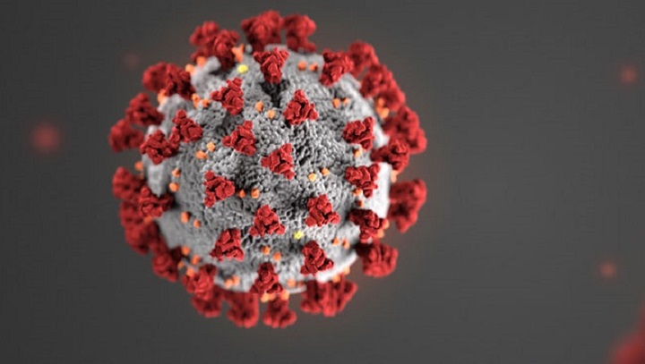
When the COVID-19 corona virus began to be depicted visually in early 2020, its protein spikes (which give it a semblance of a crown) were always colored red. This puzzled me, and I explored it by putting together several sources of information.
From my earlier work on the visual depiction of nanoscale objects, I learned about the Rayleigh limit: an optical microscope cannot resolve colors at sizes less than half their wavelength of visual light. Different colors have different Rayleigh limits; the smallest is 174 nm for the color violet.
The COVID-19 virus has a diameter of approximately 120 nm. Micrographs of the virus are apparently made by electron microscopes, probably a kind of SEM (scanning electron microscope). I believe that this instrument accurately depicts the shape and size of the COVID-19 virus and its protein spikes, but the virus and its spikes are so much smaller than any Rayleigh limit that there is no true color at that scale.
This means that the protein spikes are not red, or blue, or green, or any other color. The depiction of the size and shape of the virus is legitimate, but the color of the spikes is entirely fabricated. I do not know why illustrators chose red for the protein spikes.*
Recently I have seen a few illustrations which color the spikes black. This is just as legitimate (or illegitimate) as spikes colored red.
I do not mind which color is employed by illustrators. None is better than another. But I wonder whether it is misleading to fabricate the color of the protein spikes when other information, namely, the shape and size of the virus, is as accurate as an electron microscope can show us.
*Note on the note, added by Brigitte Nerlich:
Cara Giaimo wrote an article for the New York Times entitled “The Spiky Blob Seen around the World: How C.D.C. medical illustrators created the coronavirus pandemic’s most iconic image”, in which Chris’s question about the choice of colour is answered to some extent: “As they were styling the virus, other C.D.C. designers were working on more Covid-19 materials. The illustration ‘was going to have to go along with the branding,’ Ms. Eckert said, so they tried color schemes that matched. Red on gray, with orange and yellow accents, was the most arresting: ‘It just really stood out.'”
Image: CDC Coronavirus, Google Images, labelled for reuse


I only just came across this article on the colour of the coronavirus, but it adds an interesting footnote to Chris’s post: “Scary red or icky green? We can’t say what color coronavirus is and dressing it up might feed fears”: https://phys.org/news/2020-03-scary-red-icky-green-coronavirus.html