April 3, 2020, by Brigitte Nerlich
Images in the time of coronavirus
This post has been inspired by conversations with friends and colleagues on the SCIREPS list, particularly David and Dolores Steinman, Martin Kemp, Pascale Pollier and Roberta Buiani.
Added, 10 July, 2020. There are now many more studies of images. Two in particular stand out about images of the virus. One by Rebekah Frumkin for the Paris Review and one by Sria Chatterjee for the LSE COVID-19 blog.
How words become images
When did I first hear the word ‘coronavirus’? That must have been during the outbreak of SARS in 2003, but I had surely forgotten. Then I heard it again in January 2020. Now it’s a word we use every day. Its short for novel coronavirus whose official name is SARS-CoV-2, a virus that transmits a novel disease, namely Covid-19.
I wondered who researched and named the coronavirus first? To find out I looked at the science publication database Scopus and found that the first article to use it was published in the 1950s. It seems that “Coronaviruses were first recognized in turkeys in the United States in 1951”. The first article on Scopus dealt with infectious bronchitis published in the American Journal of Veterinary Research. Then the term lay relatively dormant until it exploded into the academic publishing scene in 2004 after SARS and now it will go supernova.
I also looked at what the Oxford English Dictionary had to say. Its definition under ‘virology’ is: “Any member of the genus Coronavirus of enveloped, single-stranded RNA viruses which have prominent projections from the envelope and are pathogens of humans, other mammals, and birds, typically causing gastrointestinal, respiratory, or neurological disease”.
The OED’s first attestation is for a 1968 article in Nature: “In the opinion of the eight virologists, these viruses are members of a previously unrecognised group which they suggest should be called the coronaviruses, to recall the characteristic appearance [sc. recalling the solar corona] by which these viruses are identified in the electron microscope.” There are two attestations for the SARS outbreak one for 2003 talking about “a new strain of coronavirus” and one for 2005 from Current Topics in Microbiology and Immunology “In addition to the SARS coronavirus.., the complete genome sequences of six species in the coronavirus..family.. have now been reported.” There will be many more attestations in future editions of the OED.
Crowns, coronas and spikes
So, etymologically ‘coronavirus’ is based on the word ‘corona’, Latin for crown, but more immediately on the metaphorically named solar corona that is to say, as the OED entry for ‘corona’ points out: “A small circle or disc of light (usually prismatically coloured) appearing round the sun or moon.” This does not quite explain the characteristic spikes of the coronavirus, which make it really what it is.
As a New Scientist article indicates, the word ‘corona’ actually refers directly back to its original meaning, namely ‘crown’: “Coronavirus particles are surrounded by a fatty outer layer called an envelope and usually appear spherical, as seen under an electron microscope, with a crown or ‘corona’ of club-shaped spikes on their surface.” Or to be more precise “The name refers to the characteristic appearance of virions (the infective form of the virus) by electron microscopy, which have a fringe of large, bulbous surface projections creating an image reminiscent of a crown or of a solar corona. This morphology is created by the viral spike peplomers, which are proteins on the surface of the virus.” (Wikipedia)
If you want to see how our novel coronavirus looks under a scanning electron microscope you can admire these great images (strangely in the Daily Mail).
Not only did the word coronavirus become commonplace this year, so did images of the virus with its characteristic bulbous spikes. There has been an explosion not only of scientific images, but also of artistic renditions, such as David Goodsell’s wonderful paintings, as well as cartoons and satirical exploitations of the virus.
For this explosion to happen, two distinctive features, what one might call ‘affordances’, proved fruitful, namely the spherical shape of the virus, the ‘globe’, and the spikey proteins protruding from it, the ‘spikes’ – some called it the ‘spikey ball‘.
Let’s now have a look at some of the ways these shapes shaped not only the scientific imagination but also the political imagination. What we see is a sort of semantic infection from corona (crown, wreath) which is transferred metaphorically to corona of the sun which is metaphorically transferred to a virus which then through its shape and function inspires/infects many more metaphors and images.
Into this metaphorical and largely also satirical mix, we must throw a beer called ‘Corona’, which caused some confusion for a time. As Wikipedia points out “Corona Extra is a pale lager produced by Cervecería Modelo in Mexico and owned by AB InBev in Belgium. It is one of the top-selling beers worldwide. […] Since 1998, Corona Extra has been the top-selling imported drink in the United States.”
Scientific images and visualisations
There are of course numerous scientific illustrations that range from microscope images to schematic drawings. This one used in The Economist is a good example of the latter, where one can see the fat layer which we now all destroy through handwashing with soap and the spike protein which is central to the virus’s survival and reproduction, and of course its name. There are many more!
There are, of course, also 3D scientific models of viruses, such as this early one of an adenovirus from the Science Museum Group Collection, made by Mrs. C.V. Waugh, 1974-1976. “This cardboard and plastic model shows type 5, which causes respiratory infections.“ A photo of this model was used to illustrate a blog post by Roger Highfield on coronavirus testing. One could write a whole history of how such models emerged, who made them, in this case a woman, what material was used and so on!!! (I have now found a 3D model of the SARS-C0V-2 here)
I have no space here to go into more detail about visualisations, let alone infographics…. BUT if you want to create your own coronavirus visualisation, here is a tutorial by experts.
Sciart
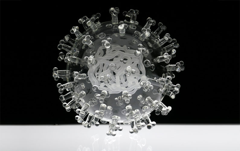
At the other end of the spectrum (but overlapping with scientific images, of course), we have artistic renditions of the virus, like the already mentioned paintings by David Goodsell. But other types of art also got involve, such as glass blowing. Not surprisingly, the artist Luke Jerram produced a beautiful glass version of the virus (see featured image) and said: “Helping to communicate the form of the virus to the public, the artwork has been created as an alternative representation to the artificially coloured imagery received through the media. In fact, viruses have no colour as they are smaller than the wavelength of light.”
Janus & Sons Art lab produced a more satirical and virtual glass sculpture of the virus where the spikes are replaced by the necks of corona beer bottles, an image found by David Steinman. (Reproduced here with permission)
Roberta Buiani alerted me to some amazing sculptures on an Australian beach. They are by Canadian artist WhiteFeather Hunter who is doing her PhD at the University of Western Australia and is stuck there for the time being. You can admire them here!
The biological anthropologist, science communicator, public engagement expert and artist Alice Roberts made a drawing entitled “Under siege” that depicts people wearing masks and carrying bows and arrows shooting (anti-virals) at a mass of viruses from a high rock. The arrowhead is apparently an antibody (immunoglobulin).
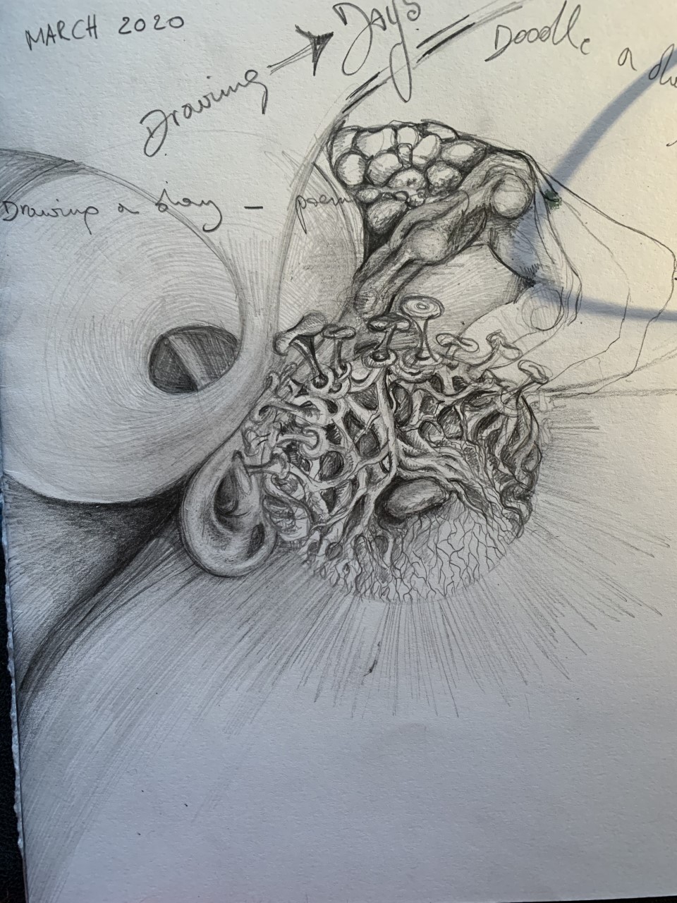 Pascale Pollier, whose “work attempts to capture the point where art and science meld“, made a drawing or doodle while stuck in London entitled “Coronavirus taking root and falling on deaf ears” (reproduced with permission), which packs a lot of meaning into one image.
And here we transcend scientific images and even artistic images of the virus and enter the political and satirical scene.
Political images
Let’s see how the sphere and the spikes, separately or together inspired metaphorical, political and satirical elaborations…
Going global
I shall start with an image that are based mainly on the sphere and highlighting the global nature of the pandemic. This for example is an article against using the virus as a metaphor illustrated with the visual metaphor of a table top globe, but a globe that is the virus.
The next image also uses the globe but it’s the earth suspended in space with the spikes depicting industrial production of food (I think). The focus of the article is on global responsibility.
Another image, this time the front page of The Guardian, was published when the UK went into ‘lockdown’. The big black and white image depicts the earth with the virus cut in half and the two halves enveloping the earth from the top and the bottom, gradually covering it and shutting it in like a two-ended butter dish.
Now, we get into more interesting mixtures of metaphor and image. In my blog post on metaphors, I had pointed to Cuomo’s use of the image of falling dominos to illustrate the spread of the virus. In an image for The New Yorker the global spread of the virus is represented by the spikes of the virus being drawn as dominos. We have a metaphor laid over an image. As Martin Kemp said when he saw the image: “I much like the idea the act of drawing can bring together different things – which other modes of thought have not done”.
In an article by Dan Sarewitz on science, politics and values the dome of the White House is rendered as half a virus globe….. and so on….
Going satirical
There are some images that go from the world to the White House to those inside the White House, namely Donald Trump, and here many of the images focus on the metaphor of the crown underlying the images of spheres and spikes.
There are innumerable images that play with the corona-crown and President Donald Trump’s hair and head, such as this street art – but somebody else will have to study that on its own, indeed all the cartoons around Trump and the virus. Here is one more example used in an article on conspiracy theories in Arab Media. There is even one image where the spikes of the virus are rendered as MAGA hats….
Cartoons
And so we come to political cartoons, of which, again, there are many. There is one list of cartoons collected by Politico and another by Delhir. And I bet there are many many more, too many to analyse here. I just want to flag up, yet again, an opportunity for analysis.
When you look at the shortish list on Politico, you can see that the virus morphs into all sorts of round and spiked objects or subjects, not just human heads but also, for example, a football headed from Italy towards Europe (the goal), and so on. In another cartoon not on this list, two viruses (coloured half green half blue) turn into the scales of justice. The article in The Atlantic where this image appears is about the political polarisation in America – so I am a bit surprised not to see the colours red and blue on the virus drawings.
I unearthed my second source of virus cartoons by trying to find the source of a cartoon that showed up on twitter, but without source information. It turned out to be cartoon by the Greek cartoonist Dimitrios Georgopalis. The cartoon shows an hour glass, symbol of death; but instead of sand we see a squashed virus occupying the top half, squeezing skulls through the neck of the hourglass which accumulate in the bottom half. Two doctors in protective gear try desperately to tie of this ‘neck’ of the hour glass, which of course is made of glass, so this action is counterintuitive.
I found this great cartoon in a list of cartoons collected by the Hungarian media organisation Delhir. I can’t even begin to describe all the cartoons you can find there! And they are probably only the tip of the cartoon iceberg globally!
There are, by the way, many more great cartoons by Dimitrios on his Twitter feed, such as one depicting the now iconic toilet role with earth’s innocently sleeping head propped against the role and an angry virus approaching on the loo paper that extends from the role, like on a runway.
Corona as a cultural phenomenon
So, after an outbreak of metaphors and an outbreak of music, we also have an outbreak of images. The novel coronavirus has become a truly social and cultural phenomenon. It has spread into our bodies, societies, into science and art, into popular culture, into languages and minds.
A warning: this only scratches the surface. A whole other book could be written about art in the time of coronavirus! To start with here is a collection in Politico. But there is much more out there! There are also people recreating classical masterpieces… classical masterpieces being changed to include references to the virus or social isolation etc etc. The same goes for cartoons. One chapter of such a book could be on cartoons and images for ‘social distancing’, such as this one and this one…..and thousands more…
PS, 4 March, 2020 – an article by Sarah Elizabeth Lewis about what images are NOT there: images of death and suffering!!
Featured image: Luke Jerram glass sculpture, with permission: “COVID-19 – glass sculpture in tribute to the huge global scientific and medical effort to combat the pandemic. Made in glass, at 23cm in diameter, it is approximately 2 million times larger than the actual virus. Commissioned 8 weeks before the pandemic, by a university in America to reflect their current and future research, learning in health, and its focus on solving global challenges.”


Annamaria Carusi has written a short piece on two types of images related to the coronavirus: things and trends https://blogs.bmj.com/medical-humanities/2020/04/22/things-and-trends-images-of-covid-19/ Great stuff!