September 16, 2013, by Brigitte Nerlich
Making science public: A question of colour
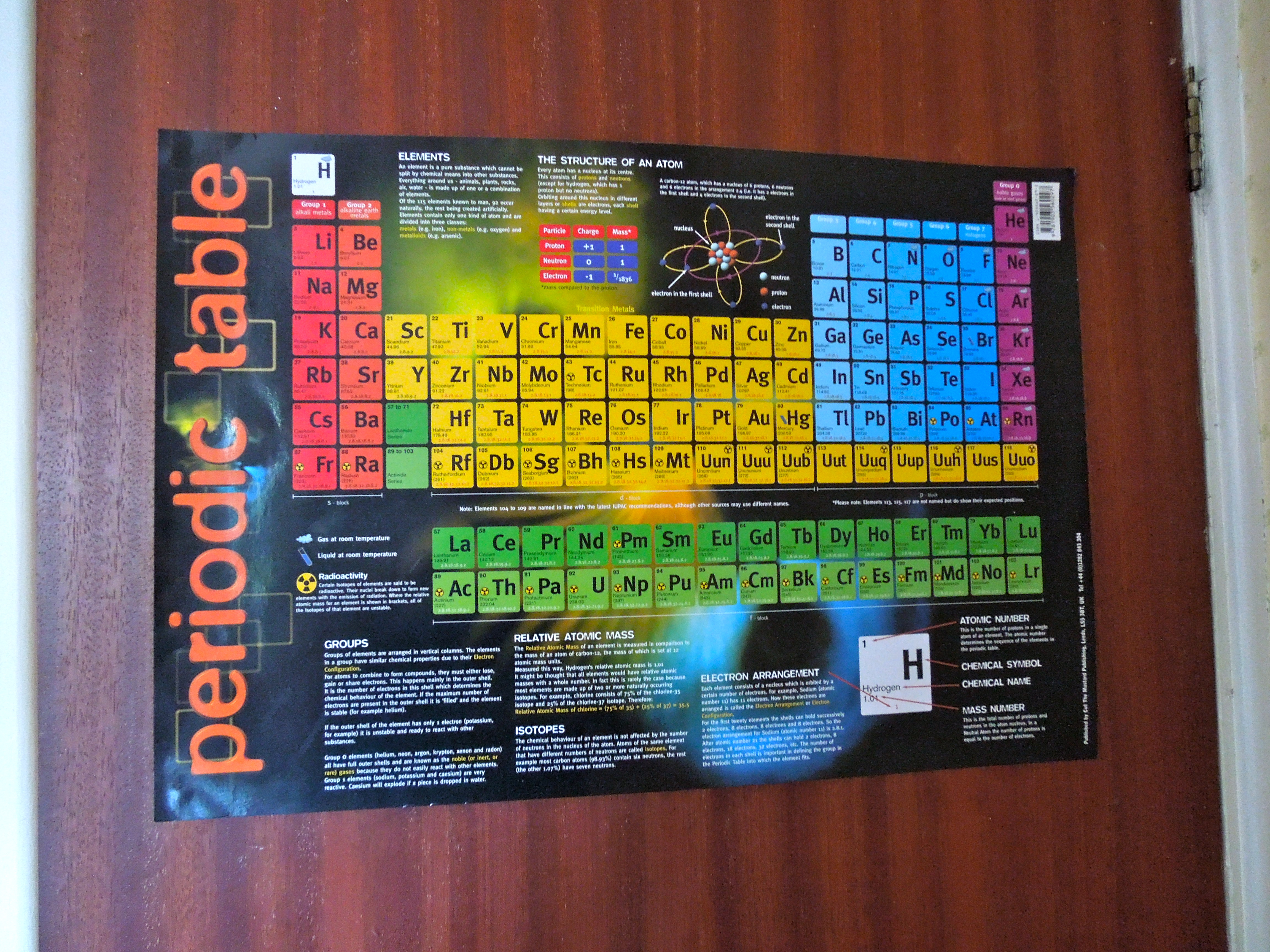
Yesterday I was staring at a poster of the periodic table hanging on our kitchen door, a remnant of my son’s school days. I began to muse; imagine it was just a black and white series of elements and numbers, as it was when it was first invented? Who decided to colour it in, and when and why? In this case, the colours are not necessarily important to the science, but they surely are for teaching and learning and understanding. The colours probably contributed to the periodic table’s popularity and its almost iconic status in science. However, this rise of the periodic table could only happen once colour printing became cheap and ubiquitous, and once, perhaps, colouring such a serious scientific endeavour was seen as acceptable.
Be this as it may be, all this made me think about colour coding and colour choice in science. I began to ask myself a series of questions, some of which have been addressed in the academic literature, some of which haven’t (as far as I know!), but should be.
Colour conventions and colour choices, aesthetics and science
There is an immense amount of literature that discusses issues around colour in science, from colouring invisible nanoscale phenomena to colouring the universe, by way of colouring molecules, bacteria and so on. There is, of course, also a growing literature on the use of colour in data visualisation. These articles, books and conferences, by scientists, historians of art and science, artists and scholars of science and technology, as well as visualisation experts and designers, discuss the contributions that aesthetics and science (for example our increasing understanding of how vision and perception work) make to the production of such images, and much more. Some researchers are even beginning to tackle the ethical implications of such colour choices. However, there are still a lot of questions that need to be addressed.
An artist that I very much admire, Luke Jerram, highlights some of these questions, which were also discussed at various conferences last year, including one organised by colleagues and myself, but they don’t seem to have been satisfactorily resolved: “His transparent and colourless glassworks consider how the artificial colouring of scientific microbiological imagery, affects our understanding of these phenomena. See these examples of HIV imagery. If some images are coloured for scientific purposes, and others altered simply for aesthetic reasons, how can a viewer tell the difference? How many people believe viruses are brightly coloured? Are there any colour conventions and what kind of ‘presence’ do pseudocoloured images have that ‘naturally’ coloured specimens don’t? How does the choice of different colours affect their reception?”
Colour choices and conventions have also recently been discussed on a more planetary scale at NASA, and in this case some questions seem to have been resolved. The debate was triggered by a letter claiming NASA had used “a perceptually incorrect color scale”, that is to say, had used ‘rainbow colours’ for continuous data, which are, at least for some viewers, difficult to read. This elicited a response and a change in colour schemes used to represent satellite data, for example (but experts better read this rather interesting blog post themselves, rather than me trying to summarise it!). On twitter readers recommended various colour tools, such as colour brewer and color tool to improve representation and interpretation of data. Again, there is no literature, I believe, about the use of these colour tools now and over time, something that is however important in the context of visualising and communicating climate change, for example.
Disciplines, interdisciplinarity and public engagement
I also haven’t found any readily available and readable literature dealing with issues that might arise from the use of colour choices and colour conventions between disciplines and between science and society. That is to say, are some colour choices and colour conventions discipline dependent? What does this mean for interdisciplinary collaborations and knowledge production? Do people have to learn colour conventions and how to read colours in each discipline? What about lay people who want to engage with science? This is especially important in an age when we are confronted with statistical information that, more and more frequently, arrives in the shape of colourful visualisation packages.
Colours and cultures
What about the fact that colours have very different symbolic values in different cultures and at different times in history (some of this has even been visually colour coded)? Does this influence the choice of colour in the doing of science across the globe or have things become too globalised for that? Has there been a process of unification or standardisation of colour conventions over time? What does it mean for doing and understanding science in different cultures? One book by Elizabeth Kessler, Picturing the Cosmos, is quite fascinating in this respect as it examines the Hubble’s deep space images, highlighting the resemblance they bear to nineteenth-century paintings and photographs of the American West and their invocation of the visual language of the sublime. What does that mean for the people who ‘read’ and enjoy these images across the globe?
The politics of colour choice
What about the politics of colour choice? Maps and data/information visualisations are increasingly used to inform policy makers and are used by policy makers to inform the ‘masses’ about social and scientific issues. How is this back and forth between maps and data visualisations and their political uses negotiated? As our project is called ‘Making science public’ and deals with ‘science and politics’, I would love to know more about links between colour, science and politics in this context.
A few days ago on Friday 13th, 2013, a report came out for example, in the context of the forthcoming and soon to be controversial fifth IPCC report on climate change, in which the colour purple was discussed. Purple has been introduced to signal severe climate risks, which was up to know a task allocated to red. Deep purple and pink had first made their appearance on the scene of climate change communicating during this year’s Australian heatwave. Some may see this as a good way to communicate new aspects of climate change, some may see this as adding to what they regard as pervasive and increasing ‘alarmism’. Colour is a political issue.
Colours and science communication
And finally: what about colour and science communication and science writing? It is well-known that ‘colour sells’, so why is there so little research specifically into colour and science communication? Felice Frankel and Angela H. DePace have recently published a book where some issues around colour and science communication are discussed, entitled Visual Strategies, but I think we need more research on this topic in the context of science communication.
This (apparent) dearth of accessible work on the topic of colour conventions and colour choices in science is quite astonishing, as colours make science public, for good or for ill. They are a bit like metaphors in this respect, as they can highlight and hide certain issues, as well as enable or obstruct our access to and our understanding of science.


Just had a chance to really read this and it is wonderful! There is so much here, so much to think about. Thank you for doing this.
Thanks! I am glad you liked it. Yes, there is so much more one could think about, if only one had the time….
[…] followed this up with a post on an asset-based model of science communication, on the importance of colour in science communication, and on public engagement and Prussian forestry. She also contributed a […]