19/06/2013, by CLAS
Windows on War: An Online Poster Exhibition
In 1969 as part of the legacy of Vivian de Sola Pinto (formerly Professor of English) the University acquired a rare collection of Soviet posters from WWII. These posters were hand-made almost every day during the war to keep the population abreast of progress, to maintain morale and attack the enemy. Yes, they are propaganda, but they are remarkable artefacts in themselves. They are large, up to 2 m x 1.5 m, and were designed to be hung in the huge windows of the TASS building in Moscow. Then to engage the maximum number of spectators they spread out to offices and shops with windows facing busy thoroughfares.
Recent intensive work on the collection for the development of the Windows on War website has made me ponder the following question a number of times:
What makes a poster draw spectators?
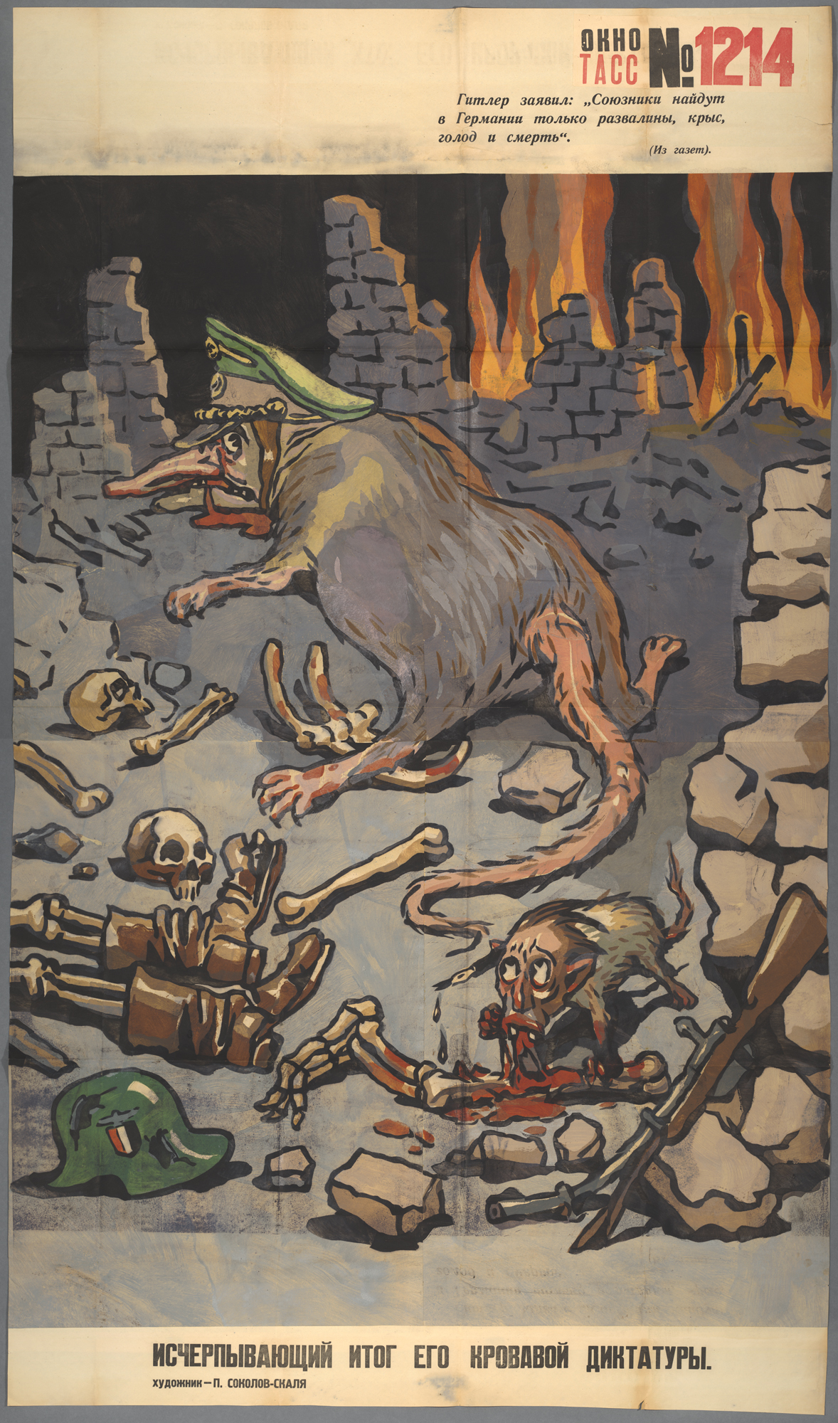
This poster was created in April 1945, almost at the end of the WWII. The TASS (Central Information Agency of the Soviet Union) windows are easily recognisable for their unique physical and visual construction: hand-stencilled squares pasted together, a vivid but limited palette, a TASS index number, and a combination of image and text. There are 129 of them in the collection. They were made to be displayed in the TASS building windows and other large offices or shops, in Moscow and major cities, with windows facing onto main thoroughfares to maximise spectatorship. This poster is large: more than one and a half metres long by one metre wide.
The primary aim of the windows was propaganda to cement the ‘official’ view of the war and to raise Russian morale by undermining the enemy. The graphic skills of caricature and cartoon are strongly evident, but are they alone sufficient for drawing in the spectator?
In the above example, Hitler and Goebbels are shown as rats (Goebbels was diminutive in real life and subject to Hitler, so is naturally smaller) feeding in the ruins of a burning German city. Take another look: the sheer theatricality of the image is astonishing. Look at the spatiality and physicality of the figures. Not only do we have them placed so that Hitler can ‘upstage’ his henchman, but his grotesquely bloated body physically dominates the image. The ruins provide a stage set, with managed pyrotechnics in the background. The colours are controlled: dark, splashed only with blood and reflected in the flames at the rear. There is a risk too, for the blood is also echoed in the familiar Soviet red TASS logo and poster number, the signifying mark of a ‘window’.
Another story is narrated visually through props in the foreground: various limbs including a skeletal pair in boots, a discarded German helmet and abandoned rifle suggest the enemy are feeding on their own. Hitler’s jaws are bloody, and a closer look reveals Goebbels is gnawing a limb with the blood still oozing.
In this instance, the voices of the texts are even in dialogue. The lines at the top read: ‘Hitler has declared: “In Germany the Allies will find only ruins, rats hunger and death”‘. In counterpoint, the caption states: ‘The culminating point of his bloody dictatorship’.
Such an image appeals to the dark sides of the human instinct, driving to that gaze which becomes transfixed when confronted by such ‘attractive repulsion’. Superbly designed to pull in spectators, this poster is poised on the same knife edge of risk that drives good theatre. Image and text are in tension, the content is dark and theatrically displayed, and spectatorship becomes compulsive.
You can see this poster in fantastic detail with commentaries and factual information at http://windowsonwar.nottingham.ac.uk/poster/TASS-1214-The-Culmination-of-his-Bloody-Dictatorship
Cynthia Marsh, Emeritus Professor, Russian and Slavonic Studies
No comments yet, fill out a comment to be the first


Leave a Reply