June 25, 2014, by Tara de Cozar
Research Showcase roundup part the second – including the winner!
Continuing with the Research Showcase roundup (the first one’s here). Next on my list of ‘ones to watch’ from an artistic flair perspective were (drum roll, etc)…
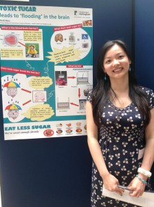
Beili Shao, Clinical Sciences, ‘Toxic sugar leads to ‘flooding’ in the brain’
Beili’s poster featured a picture of a dog in a raincoat, illustrating the blood/brain barrier. What’s not to like?
I also liked the way that the design of this poster took the reader on a very clear path through the information presented. She also wasn’t afraid to shy away from grim imagery – a well-placed gravestone clearly signposted the risks of too much sugar.
The purist in me isn’t too keen on the headline font, but that’s beyond picky really. Good poster all round.
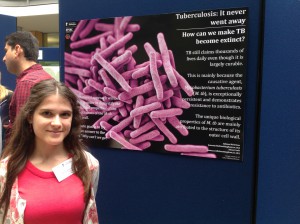
Athina Meletiou (left), Chemical and Environmental Engineering,
‘Tuberculosis: it never went away’
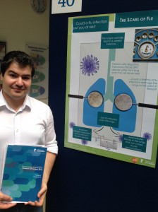
Anastasios Stavrou, Medicine, ‘The scars of flu’
I’ve put these two together because I liked them for the same reasons. Minimal text, good use of images and a clear path through the information on the poster. Both of these were in my mind as potential winners for those reasons. I think people – whatever their prior knowledge – would come away from reading these with a real understanding of the research projects. And, after speaking to Anastasios, you also come away with the urge to get a flu jab.
Which brings us to the winner…
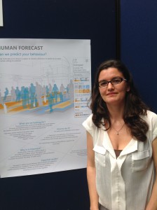
Julie Waldron, Engineering, ‘Human behaviour forecast’
Julie’s poster looks amazing. She went for a weather forecast concept and used this to track and predict human behaviour – information which could then be used to design better public spaces. I loved the image. Julie took photos of people moving around a public space and then developed a colour key to show where people relaxed, worked or lingered, and where they moved on quickly. It’s a very simple, clear and effective way of illustrating complex information over time. The top half of the poster gave you all the info you needed for a basic understanding of the research, while the text at the bottom – in an amount that wasn’t overwhelming to the eye – gave more detail if the reader wanted it.
Good concept, well thought out and executed. Top poster. Nice work Julie!
No comments yet, fill out a comment to be the first


Leave a Reply