June 24, 2014, by Tara de Cozar
Research Showcase roundup
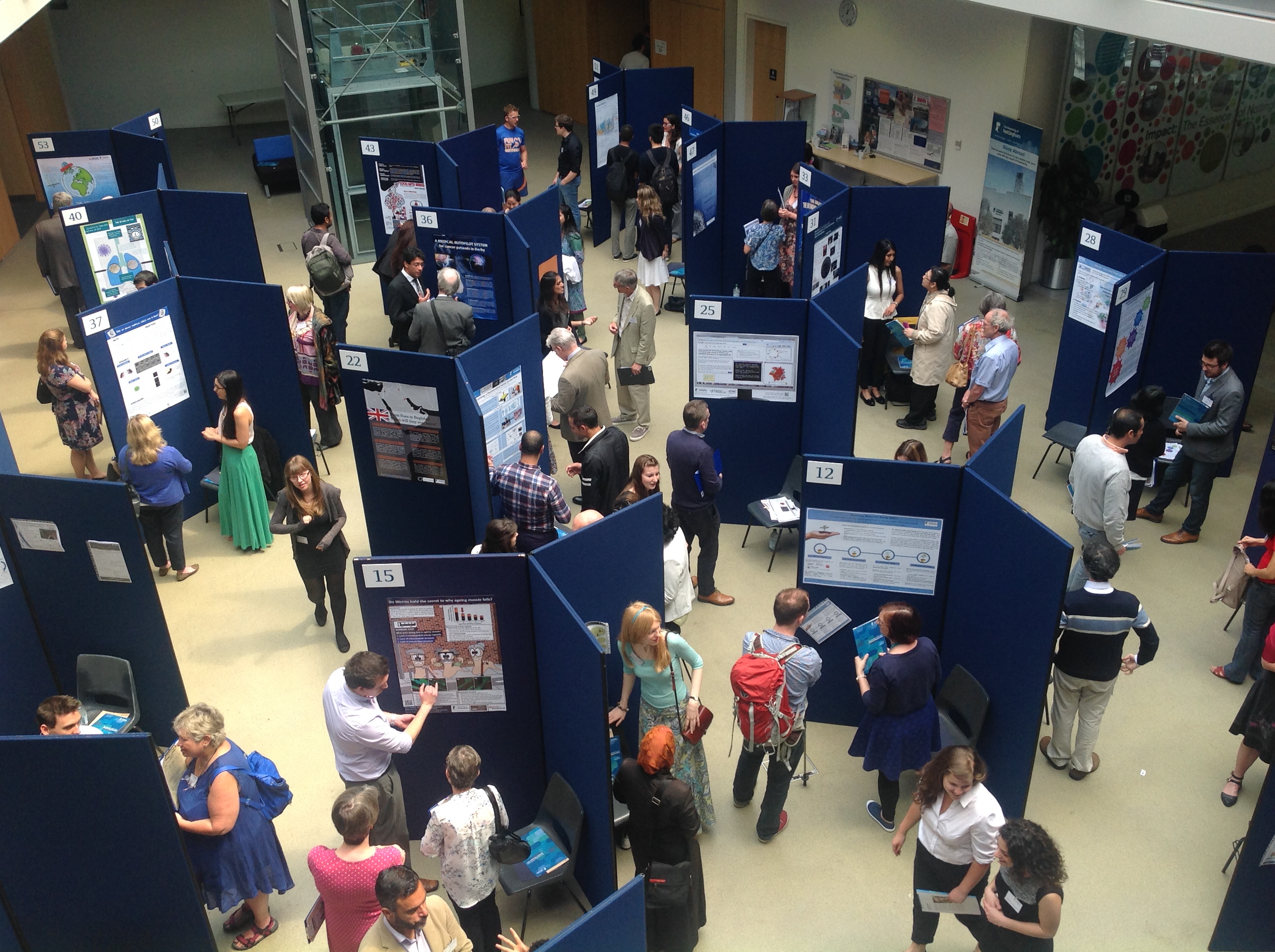
The Research Showcase 2014 took place last Wednesday, with the exhibition in the Engineering and Science Learning Centre and the public lecture – by science broadcaster Simon Singh – held in the Keighton Auditorium. It was organised by the Graduate School who, as ever, did a bang up job.
It was a brilliant day. I know I say this every year… But it’s such a good opportunity to see the breadth of research that PhD and early careers researchers are doing across the institution.
So what’s the format? Well, around 50 researchers exhibit their work in the form of a public engagement poster. They’re used to doing standard format academic posters, but those aren’t really the best way to communicate their research to people who aren’t experts in their field. The posters are judged on various criteria by a panel of experts (both internal and external to the University). I was responsible for deciding who got the Award for Artistic Flair. Which meant that as well as asking exhibitors about their research, I got to probe them about why they’d chosen to present the information how they did.
I’ll come to the winner in a bit. I wanted to highlight a few ‘honorable mentions’ as there was no time to do it at the event, but I thought they presented their ideas really well.
Researchers featured in the order I encountered them… I’ll split this into a couple of posts so I don’t get too rambly…
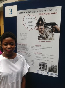
Esther Akanya, Politics and International Relations, ‘Women and Terrorism’
I could’ve spoken to Esther for hours. Her topic – how women terrorists are portrayed by the media – is of huge interest to me personally, and Esther is obviously passionate about it. Which made listening to her describe her project so engaging. She chose an eye-catching image to draw potential readers in and then set the information out very simply and clearly. Maybe the spacing could’ve been better thought through, but overall I liked the concept and layout.
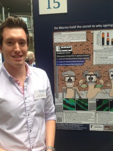
Chris Gaffney, Life Sciences and Medicine, ‘Do worms hold the secret to why ageing muscle fails?’
Despite making me feel old before he even really started (did you know muscle starts deteriorating at the age of 20? Gah!), I liked Chris’s poster because it was bright, well illustrated and had minimal scientific jargon. My only criticism is that I didn’t feel that the layout guided the reader through the information as well as Chris did when he was talking through it. But moving a few text boxes around would quickly sort this problem out.
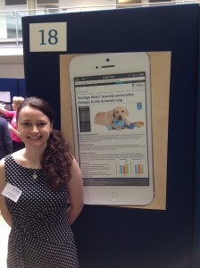
Naomi Harvey, Veterinary Medicine and Science, ‘Teenage kicks? Juvenile personality changes in the domestic dog.’
Naomi did this poster in Powerpoint – a piece of software I hate with the intensity of a thousand suns – but it looks great. I like the concept – people look at their phones to get new info all the time, so she thought it would be an engaging way to present the information. She gets extra points for faithfully reproducing the University’s press release web pages – right down to the gradient effect on one of the buttons. My only problem with this design is that the limits the size of the text. I’m being picky, but dense blocks of texts could put potential readers off. And you have to be picky when the standard is this high.


[…] with the Research Showcase roundup (the first one’s here). Next on my list of ‘one’s to watch’ from an artistic flair perspective was (drum […]