March 19, 2018, by Ross Wilson
Investigating New York’s Anthora coffee cup
The Anthora coffee cup is an iconic part of New York. Its distinct blue and white pattern can be seen in any television programme or film set in the city to signify the metropolis. Its presence on the subway and streets during the morning commute demonstrate how everyday this object has become for New Yorkers. However, its history, development and use reveal more about identity, place and design within the city. By taking an interdisciplinary approach, from such a small item, we can interpret a far wider set of processes.
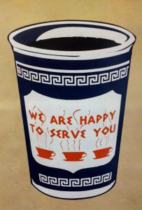
At first sight, the Anthora is engaging. Its ‘Greek Key’ patterning at the top and bottom and colour scheme with the decorative elements of amphorae and the slogan, ‘We are happy to serve you’, mark it out as distinctive. This is not your common disposable coffee cup and its design has been the reason for its success and proliferation.
The designer of the cup was Leslie Buck (1922-2010), a Holocaust survivor and post-war immigrant to the United States, who as Marketing Director for the Sherri Cup Company conceived of this specific design in the early 1960s to appeal to the Greek-owned restaurants and cafes which had opened in New York after the ‘second wave’ of Greek migration.
This movement from Greece had been forced by economic and political instability which encouraged immigration into the United States. In areas across New York, large numbers of Greek immigrants settled and began opening businesses. Indeed, Astoria in the borough of Queens became known as ‘Little Athens’ because of this movement.
As a way of maintaining cultural ties to Greece and adapting to a new culture, individuals began using references to Ancient Greek sites, heroes and mythical figures such as Sparta, Hermes, Zeus and Acropolis, for the names of their shops, businesses and cafes.
Across the homes of first, second and third generation immigrants, the architecture of Ancient Greece was also evoked with marble columns, statuettes of gods, goddesses, nymphs and heroes, mosaics and reproductions of amphorae all placed in the front yards of households.

The Parthenon, Athens.
Whilst this enabled connections to Greece, the use of classical motifs also connected these groups to the United States as the major buildings across the city, from Wall Street to the Courthouse, all draw upon neoclassical architecture. Indeed, this neoclassic style, known as the Greek Revival Tradition, was the major architectural design used after the War of Independence in the eighteenth century. Therefore, whilst this design is very Greek, it is also very American.

New York Stock Exchange, Wall Street
These traditions come together in the Anthora cup. Buck’s design uses a meandros (Greek Key) element, echoing the Ancient Greek pottery of the Geometric Style (900-800 BCE). Adorning the sides of the cup are images of an amphora of the Classical Period (600-400 BCE), whilst the symmetrical proportions of the design elements also refer to a classical heritage. However, alongside these pieces of antiquity the cup is decorated with an all-American inscription: ‘We are happy to serve you’.
The popularity of the cups was instant. Café and deli owners rushed to stock the cups for customers. Its design communicated an attachment to Greece and to the United States, the neoclassical elements made it appealing to the wider populace, whilst the convenience of a paper coffee cup was also ideal for the commuter. The office jobs that were developed in the service sector in New York after the post-war period made buying that early morning coffee cup an everyday event.
Hundreds of millions of these paper cups have been made and used over the decades. Their ubiquity in New York may mean that they go unnoticed. However, by taking an interdisciplinary approach, using classics, archaeology, history, literature, sociology and thinking about design and economics, we can reveal a far more complex set of associations with the Anthora.


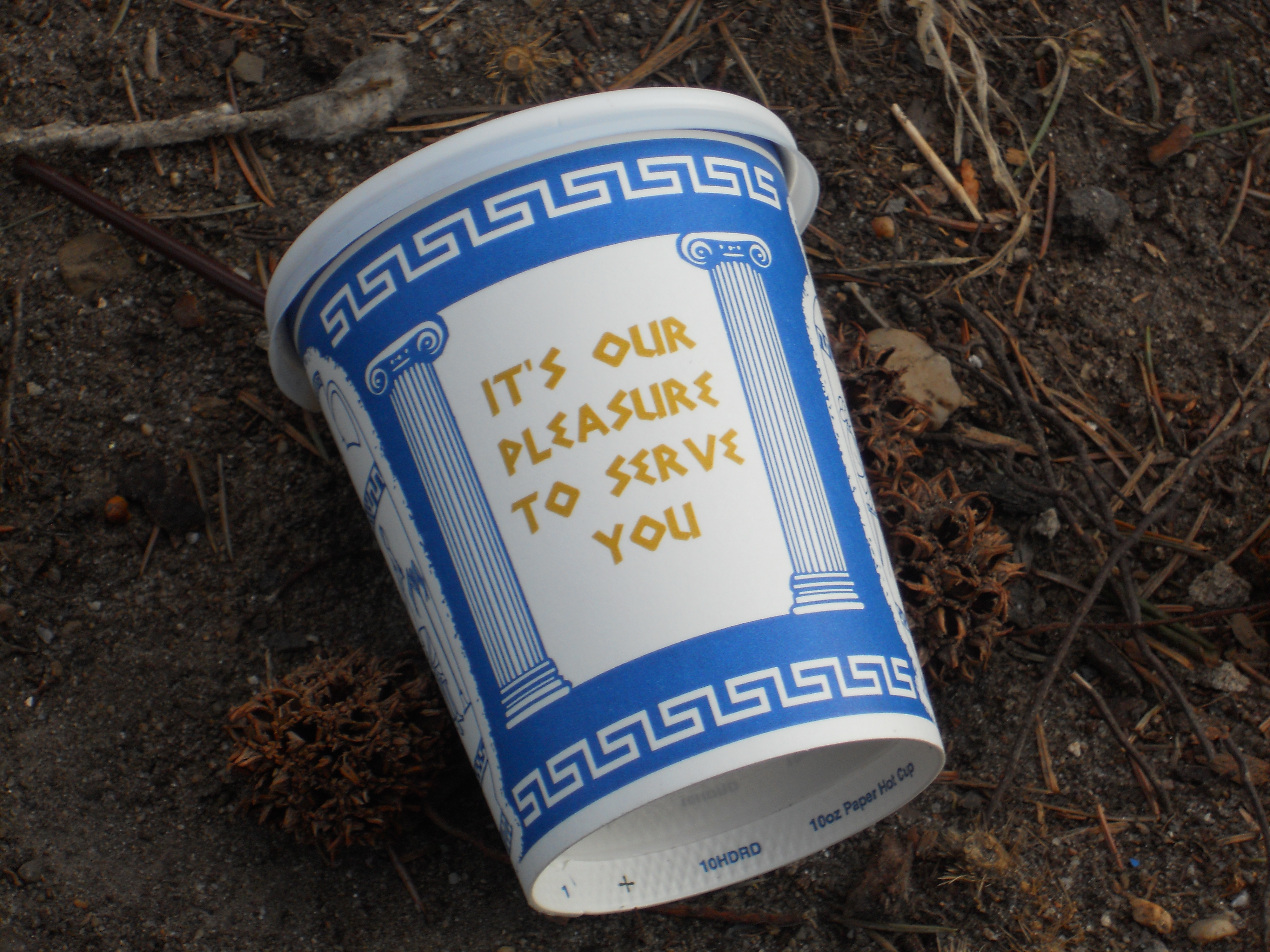
FYI the first image you posted is not of the Anthora but of one of it’s imitators.